The checkout page is a ubiquitous component of the ecommerce experience. Every customer has to pass through it, which makes this page the gateway to revenue. It’s critical that you take your checkout page design seriously by applying smart optimizations that improve accessibility and reduce friction.
In this article, we explain why your checkout page design is important and how to optimize yours for a better user experience and strong conversions.
Why Checkout Page Design Matters
Checkout page design is a key part of your checkout process. It’s the final step in the conversion flow where a visitor becomes a customer. But if your checkout page is designed poorly, you’ll suffer a high rate of checkout abandonment.
Checkout abandonment is when a customer reaches your checkout page, but decides to abandon the process. They never pay. The conversion fails at the last moment. On average, 70% of checkouts are abandoned.
Why are checkouts abandoned? Truthfully, there are many reasons, but here are the most common:
- Unexpected charges and fees
- Forced account creation
- Overly complicated checkout process
- Performance issues, errors, and crashes
- Lack of payment methods and shipping options
As you can see, most of those reasons for abandonment have to do with usability. At this point in the process, customers already like your brand and your products, at least enough to add them to the cart and move towards payment. Any problems or friction at this point typically comes from the checkout process itself.
Fortunately, you don’t have to suffer. Conversions can be increased by up to 35% with the right checkout optimization strategies. (We’re not saying it’s easy, or that it will happen overnight, but it’s definitely possible.)
Checkout Page Design Best Practices
Now that you understand why checkout page design is important, you’re undoubtedly wondering how to improve your own. Let’s go over some checkout experience best practices that will help shoppers finish the process and convert into customers. Along the way, we’ll also show you some checkout page examples.
Keep in mind, however, that best practices will only take you so far. In order to maximize your conversions, it’s important to run experiments to identify the changes that boost sales.
Allow guest checkout
This tip should go without saying, but we didn’t want to leave it out. Never force customers to make an account before completing their purchase. It’s an unnecessary step that creates friction for some customers.
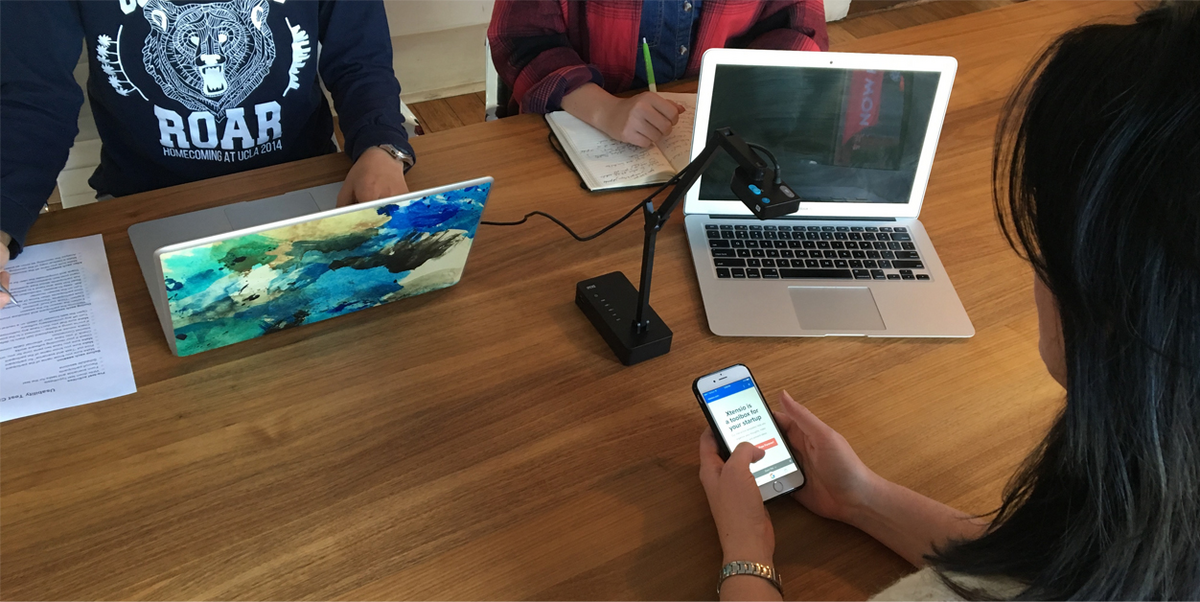
Offer shoppers a guest checkout option in order to pay, alongside options to create a new account or sign into an existing account, like the Crate & Barrel page below. If you really want to push them to open an account, prompt them again after checkout on the thank you page.
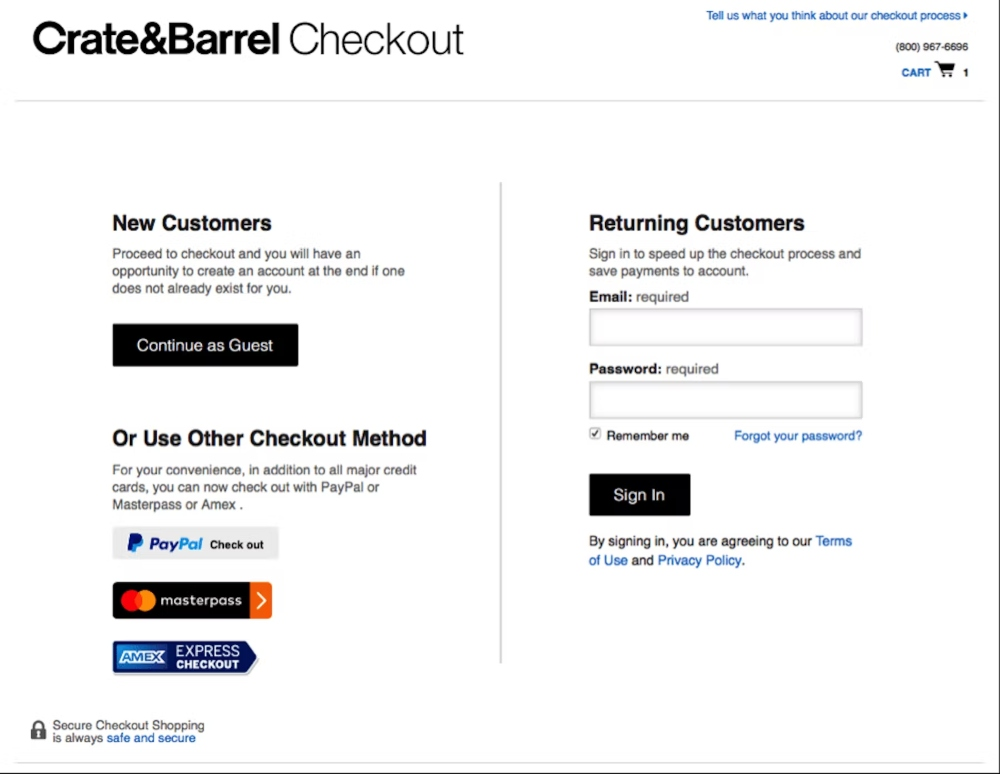
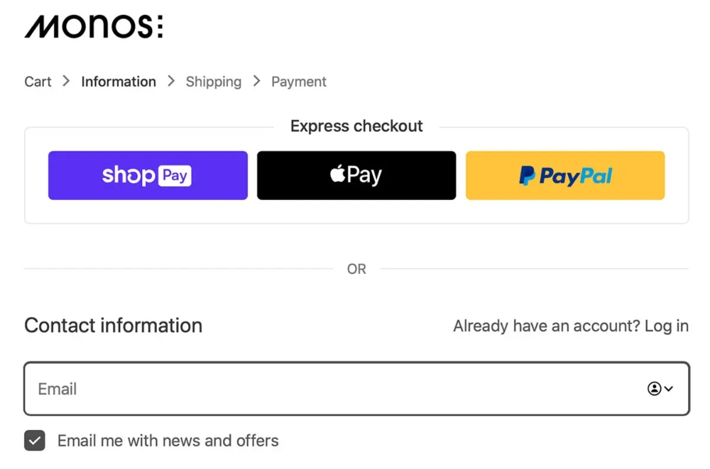
Provide multiple payment options
Buying online comes with some built-in anxiety, so it’s no surprise that people like to pay with whichever payment method they trust.
According to Statista, people want the options to use credit cards, debit cards, digital wallets (like Apple Pay and PayPal), coupons, gift cards, digital currency, and more. They have already decided to buy, so let them pay however they like.
This Monos checkout page is a great example. Customers can quickly pay with three different options, or proceed through checkout normally.
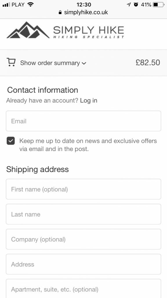
Prioritize mobile-friendly design
More than half of all internet shopping occurs on mobile, so your checkout form design needs to look great and function well on small screens. What does this mean?
- Simple one-column designs that are easy to follow.
- Large buttons and fields that can be easily tapped without hitting other elements.
- Short forms that ask for only the information you need to complete the sale.
Nearly 40% of mobile users abandon checkout because they have trouble inputting their personal information during checkout, so take usability seriously here.
Simply Hike has a great mobile checkout form. It’s clean, easy to interact with, and only asks for the information it needs to process the sale.
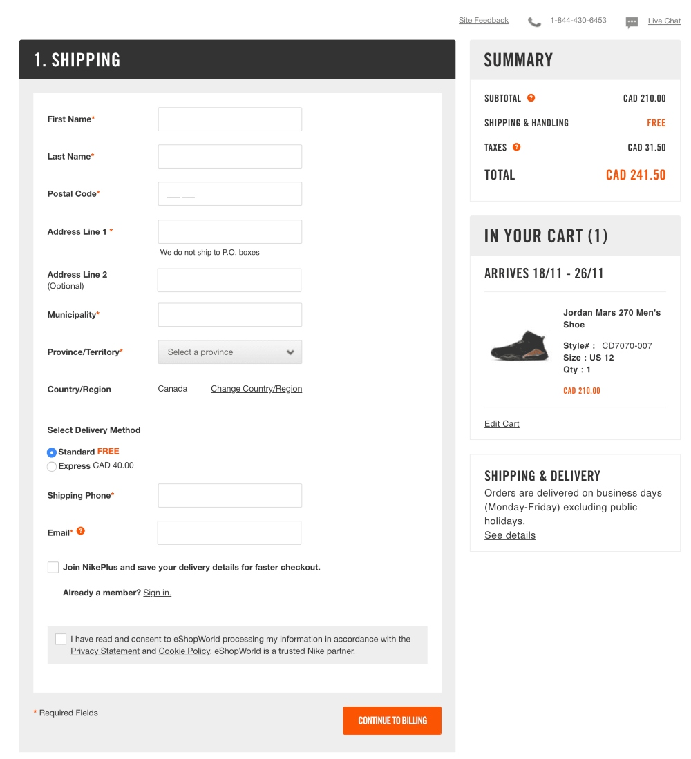
Limit all distractions
Your checkout page should have one purpose: checking out. It’s not the time for shopping, more offers, or key information. Keep your page simple and free of all distractions that might pull the customer away from checkout. You might also find it helpful to remove the page’s header, footer, and menu options to limit the user’s ability to lose focus.
This Nike page is a great example. The only elements on the page are the form, order summary, and cart summary. There’s nowhere to go but forward.
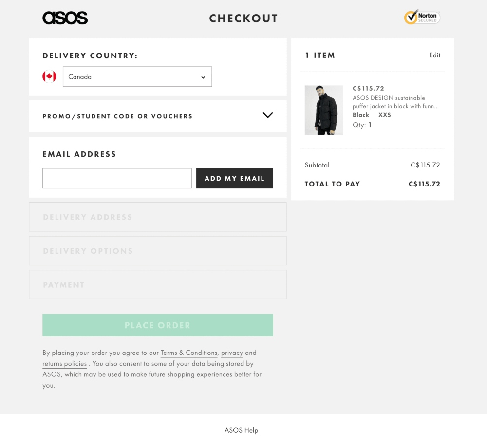
Make the shopping cart contents
Your customers want to be sure they are buying the right items, so it’s important to keep their order summary visible throughout the entire checkout process. This also keeps them emotionally connected to items so they feel compelled to pinched paying.
Asos does this well. Instead of showing a basic summary of dollar values, they include each item in the cart, including its thumbnail.
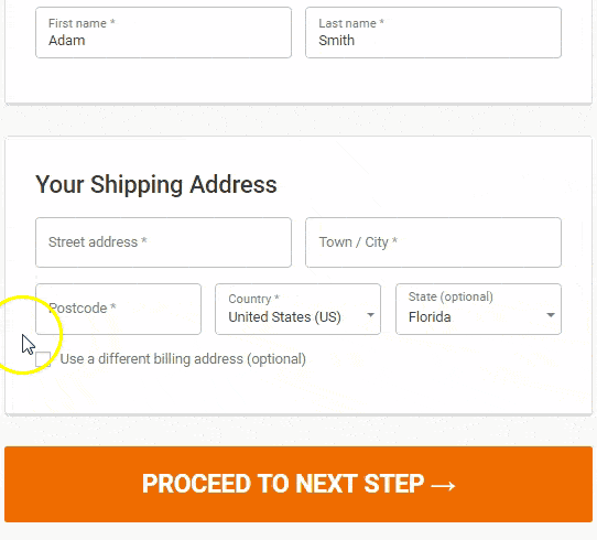
Auto-fill shipping and billing details
Entering the same information twice is a pain and slows down the checkout experience. Most customers will use the same billing and shipping addresses. After they fill out one, set your shopping cart to auto-populate the other. Just make sure customers can change that information if they do need to use two separate addresses.
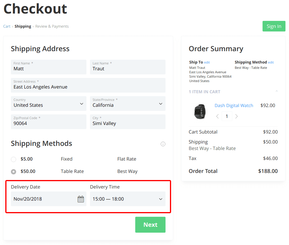
Provide estimated shipping dates
Customers want to know when they will receive their products. If they’re ordering a Christmas gift, but it won’t arrive before the holiday, that’s a detail they need to know.
Display shipping details for each shipping method on the checkout page, including an estimated shipping or arrival date. (This should not replace a shipping confirmation email with a tracking link that you’ll send later.)
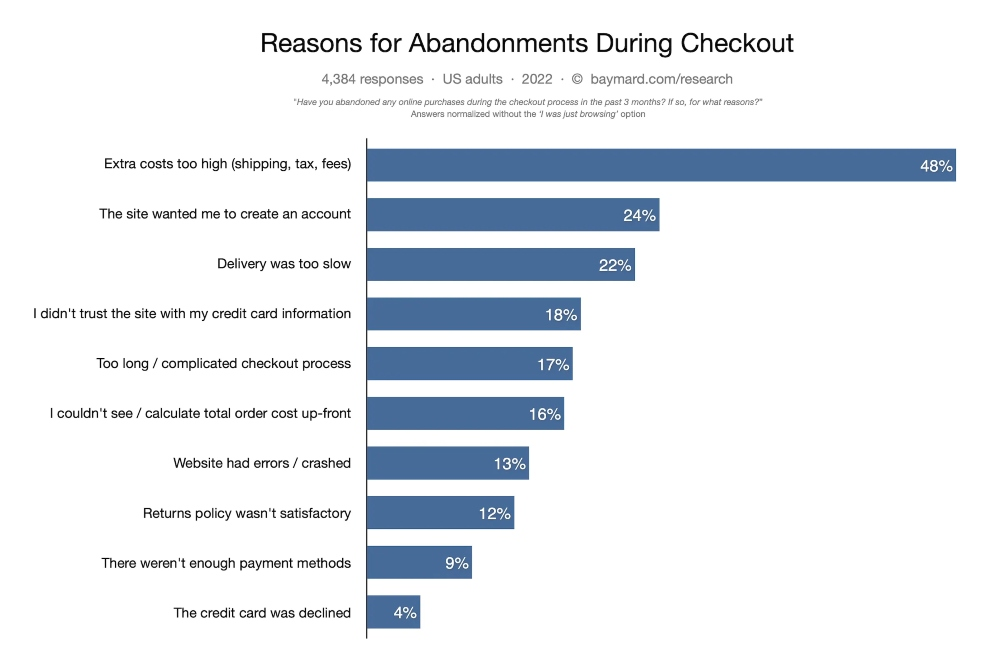
Include all costs, fees, and taxes
According to Baymard, extra costs that are only revealed until checkout are the number one reason shoppers abandon their carts. Discovering an extra fee at the end of the checkout process is a dealbreaker for a lot of people.
We recommend not stacking additional fees on your orders in the first place. Nix the administrative fee, the handling fee, or the convenience fee. If you need to charge more, raise your product prices to account. This creates a far better customer experience.
If you have to charge shipping fees – or other fees – make them clear on your checkout page design. There shouldn’t be any surprises here. (In fact, keep it super simple by building your shipping costs into your prices and offering free shipping.)
Make sure the page loads quickly
A Voucherland study learned that 57% of shoppers will abandon a site if it takes more than three seconds to load and 80% of leavers will never return, regardless of the page. They could be ready to buy, but if the checkout page fails to load quickly, they’ll leave.
Fortunately, checkout is usually one of the simplest pages on site. They typically load quickly without much optimization. Nevertheless, run a page speed test on your checkout page to determine if anything’s slowing it down. We recommend testing speed with PageSpeed Insights.
Reduce and simplify the page
Customers hate complexity. It adds friction and confusion. When they reach the checkout page they are ready to buy, so make it easy for them to pay you.
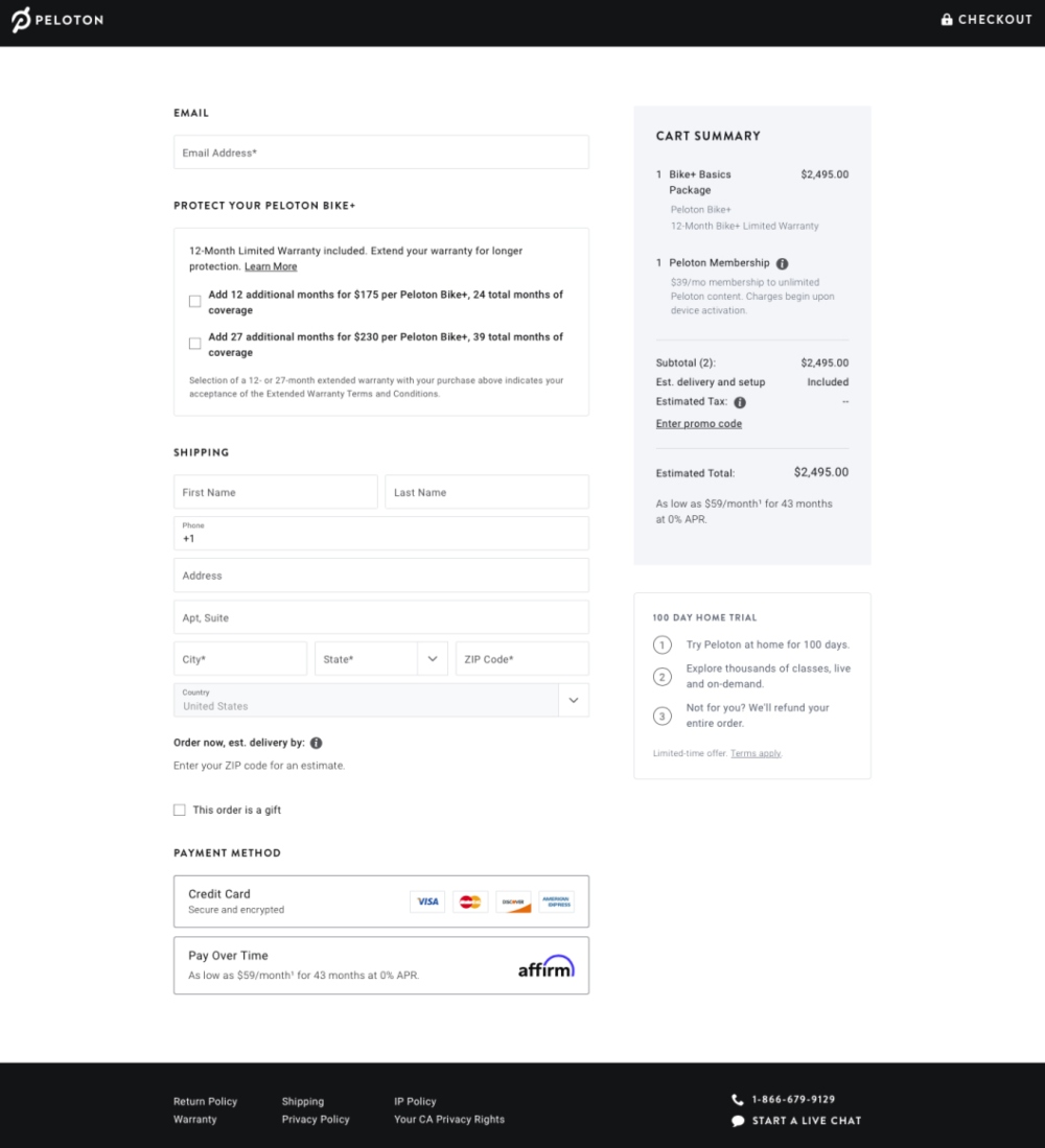
Keep your entire checkout process on the same page. One-page checkout keeps everything in one place for your customers, which makes the experience faster and easier to manage. Limit this page to only the necessary key elements. If possible, let returning customers save their personal details and payment details so you can offer an express checkout option.
Peloton’s one-page checkout does this well. Notice how there’s a clear flow down the page without the need to move anywhere else.
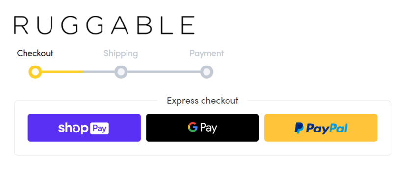
Sometimes, however, you may need multiple pages. In these cases, use some kind of visual indicator to help them identify their spot in the checkout page process and how many steps they have left to complete, like this Ruggable example.
Additionally, make your checkout buttons clear and simple. Design checkout buttons with a contrasting background color so customers understand, at a glance, what to do next.
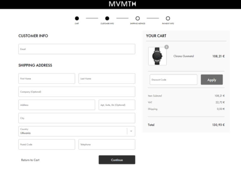
Reduce your form fields
That Baymard study also discovered that customers don’t like long and complex checkout processes. “During testing, we consistently observe that users are overwhelmed and intimidated when seeing a high amount of form fields and selections,” The Baymard Institute explains.
An easy way to simplify the process is to limit the number of fields you ask customers to complete. Only ask for the information you need to process the transaction, such as name, email address, billing address, and shipping address (if different). You can always find ways to collect additional data points later.
MVMT uses a beautifully simple checkout form. There’s no fat here whatsoever.
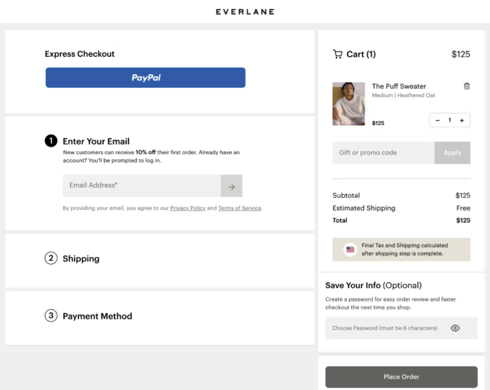
Another useful tip is to hide sections of your checkout page until they are necessary. This is a great way to make your pages less intimidating. Checkout how Everlane uses tabs to hide portions of the form until they’re needed.
Make sure your coupons work
90% of customers use coupons. Many shoppers Google for existing promo codes and coupon codes before completing their purchase. Coupons have a positive impact on conversions when they work, but when they don’t work properly, 46% of customers will abandon the checkout process.
So if you offer coupons, be sure they are active on your site. Triple check your expiration date and usage restrictions/limitations before publishing your coupons. When promoting your coupons, make sure to include all of the relevant details so shoppers aren’t confused or disappointed at checkout.
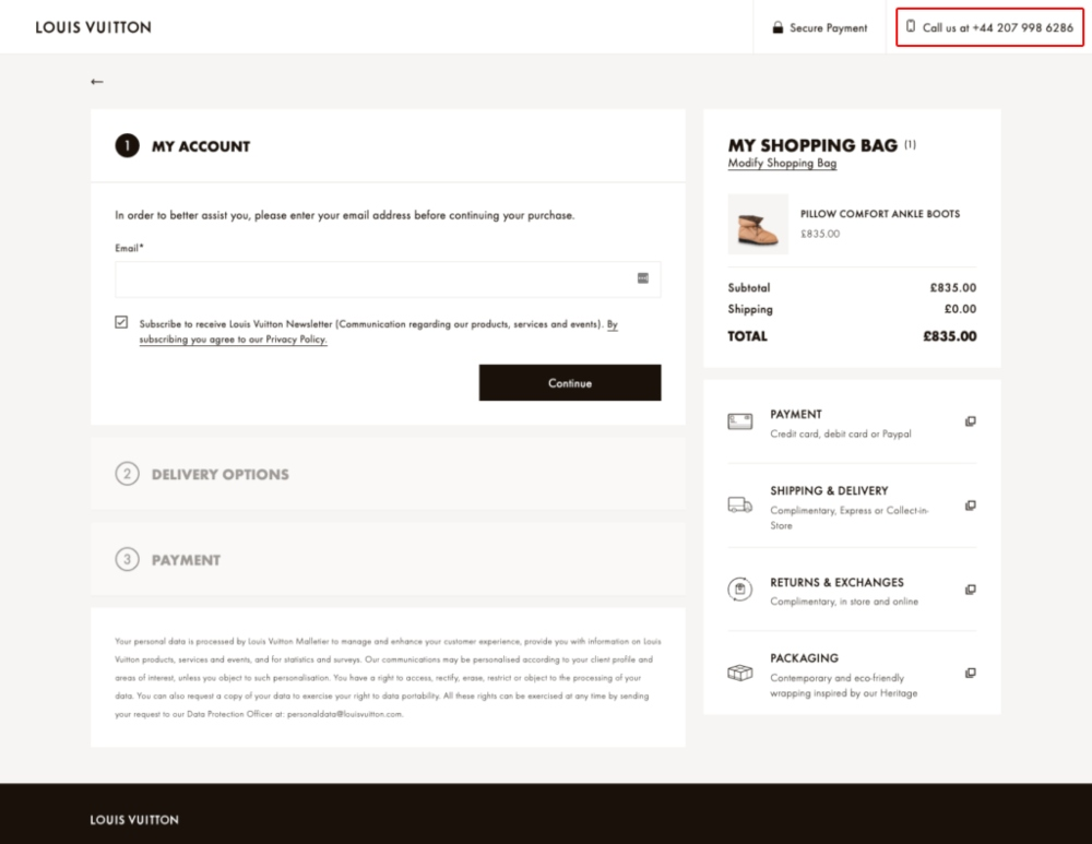
Provide customer support information
If your customers have a problem or objection on the checkout page, it’s important to make yourself available to help. If they can’t find an answer to a problem at this point, there’s a good chance they’ll abandon the sale.
Create a better user experience by making contact information available on the checkout page. Ideally, customers should be able to access a live chat feature that someone from your team monitors. This will keep them on the checkout page while they resolve the issue.
Additionally, it’s smart to include some other contact details. Email is usually too slow, so give them a customer support phone number. Just make sure someone is monitoring this number.
Display trust signals and badges
Ease customer fears by seeding your site with clues that it’s safe to buy from your store. These are called trust signals (but also referred to as trust seals, trust badges, or trust indicators). A trust signal could be a quote from a past customer, a logo of a well-known partner, awards you’ve won, or any other symbol that you’re an honest, reliable, and trustworthy brand.
The key, however, is not to clutter your site with every trust symbol you can come up with, but to display the right symbols at the right times. On your checkout page design, it’s smart to use trust signals that support the safety of the transaction. Notice how Asos’ checkout page displays the Norton trust badge because this is the moment when customers may wonder if their payment details are safe.

Checkout Page Design Optimization with Real Data
The smartest ecommerce brands understand the importance of a strong checkout experience. If you want your site to be successful, it’s important to make your checkout page fast, efficient, and friction-free for your customers.
We’ve given you a list of tips to improve your checkout page design, as well as some examples of checkout pages, but best practices are only a starting point, and they can only get you so far. If you want to achieve peak usability, you have to solicit feedback from real users in your target market.
At UserInput, we understand the importance of understanding your customer. Our done-with-you research service will stress-test your current checkout design to help you learn what your customers want and how you can improve.
How does it work? We pair you with real people in your target market who are trained to provide constructive feedback. We will help you identify friction points in the checkout process and provide you with an optimization plan from an experienced CRO strategist. You’ll quickly see a positive return on your investment.
Remember, you only get one chance at a first impression. UserInput gives you insights from real people in your target market, so you can convert more browsers into buyers. Start a research project today.