Popups are powerful tools to build an email list, sell products, or simply direct your visitors to different parts of your site. If you use them smartly, they can facilitate a healthy user experience and help you achieve many of your audience-building and revenue goals.
But if your popups are poorly designed or appear aggressively, they can interrupt your visitor’s experience and encourage them to abandon your site. It requires a careful balance, but if you
In this article, we explain why you should be using popups and offer our list of best practices to make yours as effective as possible.
What is the Purpose of a Popup?
Let’s talk about why you should be using popups in the first place.
Popups are remarkably simple. Their purpose is to present the visitor with a clear and direct call-to-action. This is your opportunity to get the visitor to take some kind of action that serves your business goals and helps them have a better experience.
Do you have to use popups? Not at all. If you don’t have a clear, compelling reason to use them on your site, don’t make up a reason just to create a popup.
While it’s true that some people refuse to interact with popups, it’s a myth that they don’t work anymore. In fact, popups are one of the highest converting marketing tools you can use on your site.
A study by iPaper reviewed two billion popups. They discovered that the number of people that interact with a popup in their first brand engagement was 11%.
OptinMonk discovered that the average conversion rate for popups is 11.09% and that the average conversion rate of their highest performing popups is 42.35%. Furthermore, here’s what they learned about different types of popups:
- Cart abandonment popups have a 17.12% conversion rate.
- Lucky wheels have a 13.23% conversion rate.
- Feedback popups have a 12.62% conversion rate.
- Seasonal offer popups have a 11.88% conversion rate.
- Facebook Messenger list-building campaigns have a 10.09% conversion rate.
As you can see, popups offer a lot of value for your business, but only if you do them well.
Best Practices for High Converting Popups
Let’s dive into the individual best practices for creating high converting popups. Keep these lessons in mind when you design your own popups.
1. Use the right format for your site
“Popup” is an umbrella term that refers to a variety of attention-grabbing techniques, each with different levels of intrusiveness.
- Classic middle-of-the-screen overlay
- Top or bottom bar
- Full-screen overlays
- Toaster popups (in the corner)
- Slideouts (on either side)
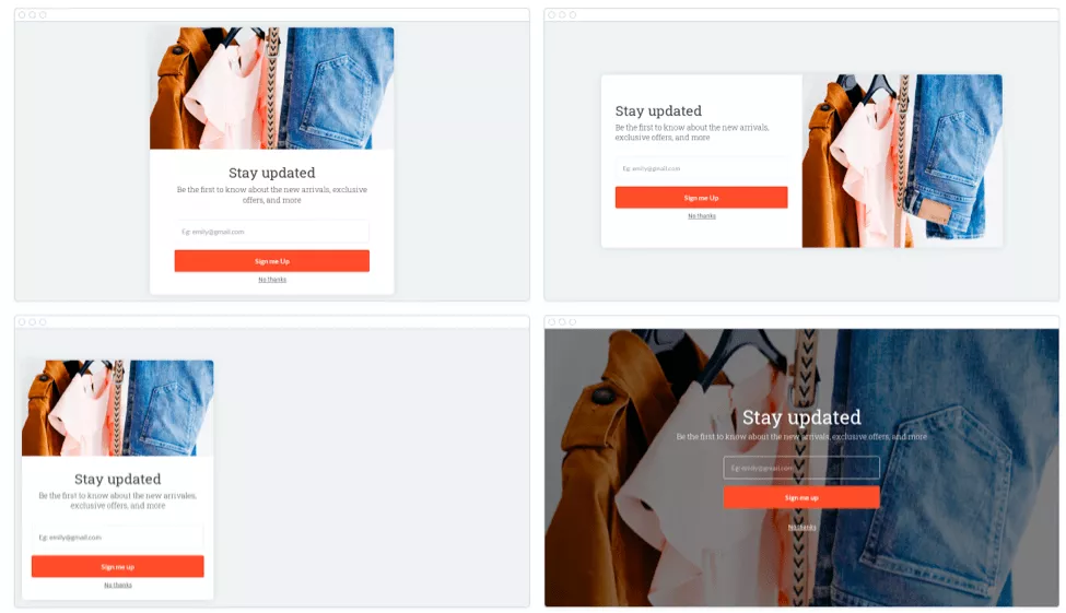
Sometimes it’s best to display the popup without obscuring the page. In other cases, it makes sense to force the visitor to interact with the popup. Ultimately, you’ll have to decide which format is right for your website. Test multiple formats until you find the one that converts the highest.
2. Offer something of value in exchange
If you want your visitors to take action, you have to make it worth it to them. There should be a clear benefit to taking that step. Call it whatever you want: value, incentive, lead magnet, or a bribe.
This benefit could be a coupon code for a discount on products, a special piece of content that helps them solve their problem, a downloadable asset (like a worksheet or checklist), access to a community, program, or course, or anything else you think your audience would find valuable.
Check out this unique call-to-action from a skincare line. They offer a super valuable piece of content – created by a well known doctor – in exchange for an email address.

How do you know what they find valuable? Consider their needs. If your visitors are usually hunting bargains, offer a coupon for today’s purchase or point them toward your on-sale items. If your visitors are looking to eat healthier, offer a downloadable meal plan in exchange for their email address.
Determining what your customers find valuable requires serious customer research. Don’t guess what your visitors want. Ask them directly. Our customer feedback service helps you identify customer pain points and desires, validate your messaging, stress-test your site’s user experience, and more. We make collecting insights from real customers as easy as ordering a pizza.
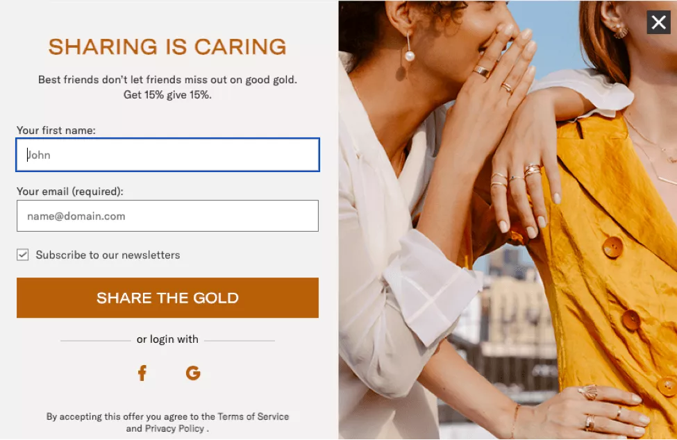
3. Keep your branding consistent
Popups that don’t resemble the site’s branding tend to look spammy and illegitimate. People wonder if they or the site have been infected with malware.
Ensure that your popups are integrated with your brand by using similar colors, imagery, typeface, and tone. If your brand is silly and playful, your popup copy should be the same. Notice how Jambys’ popup uses similar colors, font, and button styles.
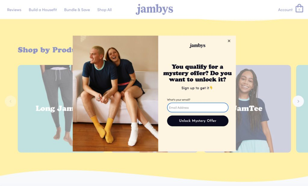
That said, it’s good to be creative here. Your goal is to catch the visitor’s eye so they don’t close your popup immediately. Play around with unique designs, animations, imagery, and colors. Don’t be afraid to run tests to see what your audience prefers.
4. Consider the timing of your popups
Have you ever been assaulted by a popup before you had a chance to read anything on the page? These kinds of popups are extremely interruptive and they’re part of the reason people find ways to block popups.
Be thoughtful and deliberate about when your popups are displayed to your users. Create rules that govern when popups display so they don’t create friction in the user experience. For instance, here are some rules you could set:
- After a specific amount of time (e.g. 10 seconds)
- After the visitors scrolls to a certain point in the page
- When the visitor is about to leave the site
- After a certain period of inactivity
- Only on specific pages or posts
Generally speaking, the longer a visitor remains on your site, the more likely they are to explore more content, opt in to your email newsletter, or purchase your products or services. This means that popups that appear later tend to convert higher, even though they appear for fewer people.
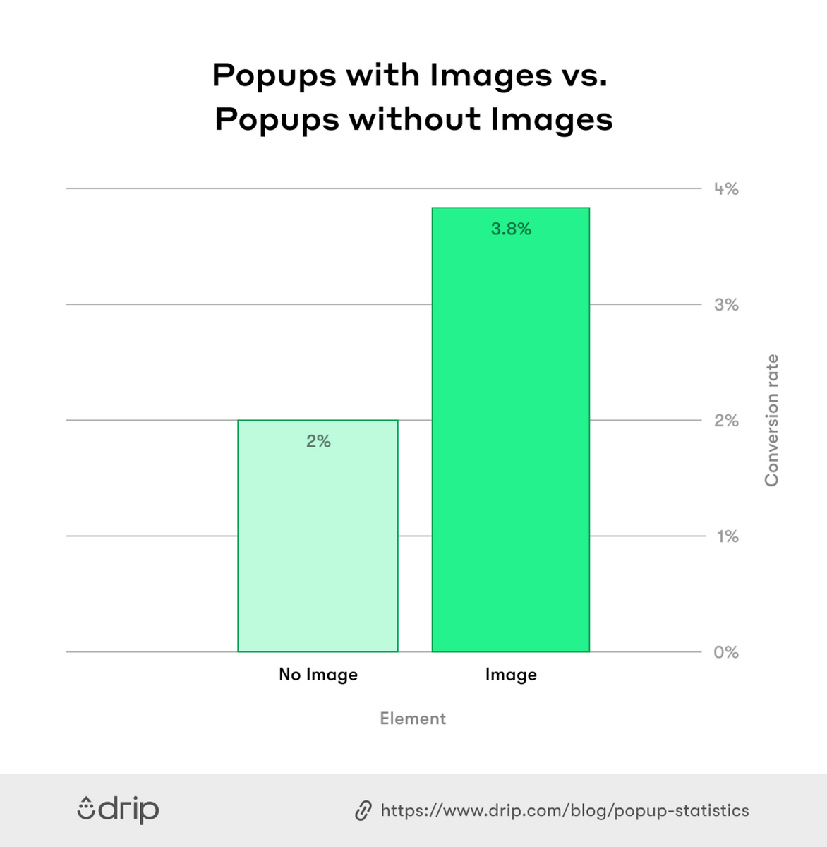
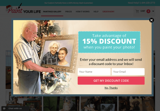
5. Use unique, custom imagery
When Drip looked at 20+ million popup views, they discovered that popups with images convert better than popups without images by 83.57% (3.8% vs. 2.07%).
Does this mean you must have an image? No. The conversion rates are pretty close. Your popup doesn’t need to have an image, though it’s worth testing.
Stock photos are inexpensive (often free) and easy to find, but they have the unintended effect of making your brand seem cheap and without credibility. Original visuals, however, make you seem genuine and authentic.
Spend a bit of money to have your own images and videos made. They can be photographs or digital renders. Create the kind of imagery that resonates with your audience.
6. Make it easy to close your popup
Popups that are hard to close are frustrating. Don’t punish your visitors by making them hunt for the close button just to use your site. If they can’t close the popup, they’ll just leave.
Place your close button on a contrasting background so it’s easy to see. Use an “X” icon or simply the word “close” so there’s no confusion. Place it in whichever corner makes it most visible.
If you absolutely need to place your button on a busy background, give it its own background so there’s clear contrast, like in this example.
7. Write short and simple copy
Your website visitors aren’t going to spend a lot of time reading the text on your popup, so you only have a couple of seconds to convince them to take action. This means your text needs to be concise, clear, and focused on the benefits your visitors will receive. Use your brand’s voice and personality, but not if it makes your copy long and complex.
Most brands find success with a traditional format: headline, short paragraph, and button. Notice how this popup uses bare-bones language but still gets the meaning across.
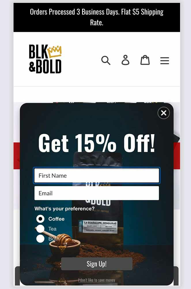
8. Reduce your input fields
Conventional wisdom tells us that fewer input fields convert better. Drip’s research basically confirmed this. They looked at one million popup views with forms that used one, two, three, four, and five input fields. Here’s what they learned:
- Popups with five input fields convert the lowest at 0.81%.3
- Popups with four input fields convert at 0.90%, which isn’t much better.
- Popups with three input fields convert at 1.08.
- Popups with two input fields convert at 3.31%.
- Popups with one input field convert at 3.20%.
So, yes, fewer fields is generally better. What’s interesting is that the drop from two to one input field isn’t that significant. If you have a popup with two fields, there’s not much reason to drop down to one, unless you’re getting millions of conversions every month and the 0.09% gain represents a significant number.
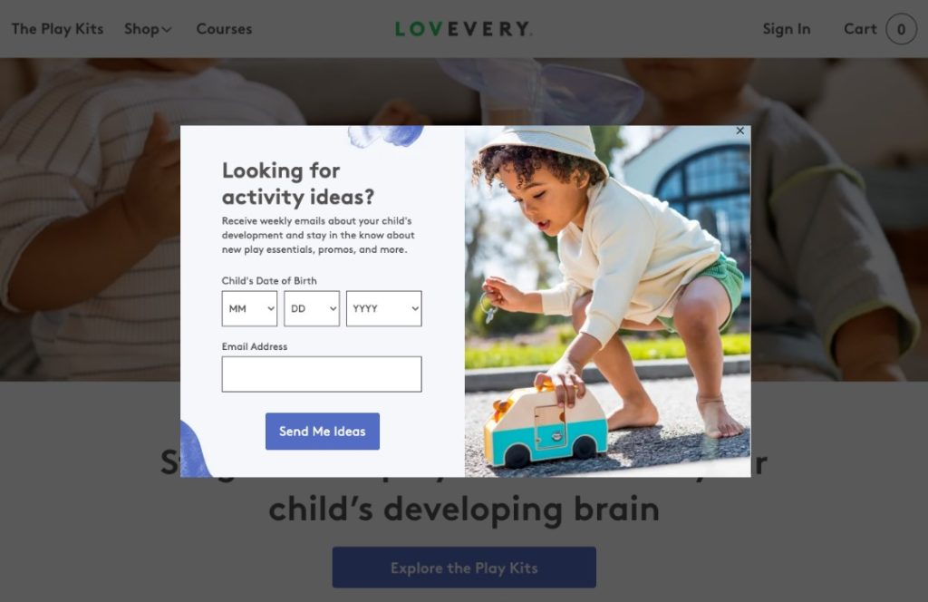
Keep in mind that you aren’t limited to name and email address fields. You can ask for anything you like, as long as you don’t overwhelm the visitor. Notice how this form asks for a birthday and email address.
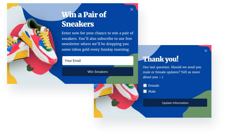
Another option here is to use a multistep form. In these cases, the first step capture’s the email address. Additional information is captured in subsequent steps. This way, if the visitor decides not to go further, you still get their email address. Here’s what that looks like:
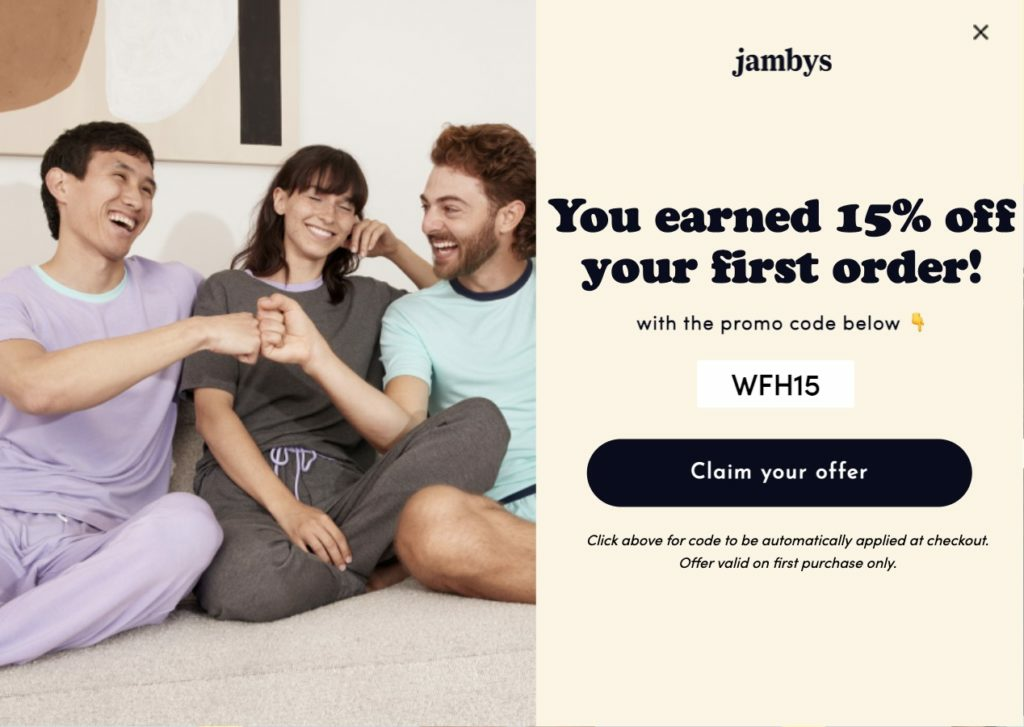
9. Include a distinct call-to-action
The whole purpose of a popup is to convince the visitor to take a specific action, so a call to action button is critical.
The text on your popup should be short and meaningful to your visitor. Mention the benefits of completing the call-to-action. Don’t ask the visitor to think about choices or options. Just give them one path forward.
Use clear, action-driven first-person language (e.g. “Start my subscription”) in your button and a contrasting color so it stands out. This call-to-action is a perfect example.
10. Make your popups mobile-friendly
60.04% of website traffic comes from mobile devices, so it’s important to design popups that display properly on small screens. If you pop up doesn’t work on mobile, it won’t be effective, and could potentially prevent visitors from using your site.
Configure your popups so they collapse nicely on small devices or design separate popups that only trigger on small screens. Be mindful of their size. Popups that cover the entire screen and are hard to close can disrupt the user experience.
Furthermore, you can minimize your popups by reducing form fields, shortening your copy, and avoiding images that are hard to load.
This mobile pop-up is a great example. It displays appropriately on a small device, all of its elements are concise and minimal, and it doesn’t take up the entire screen.
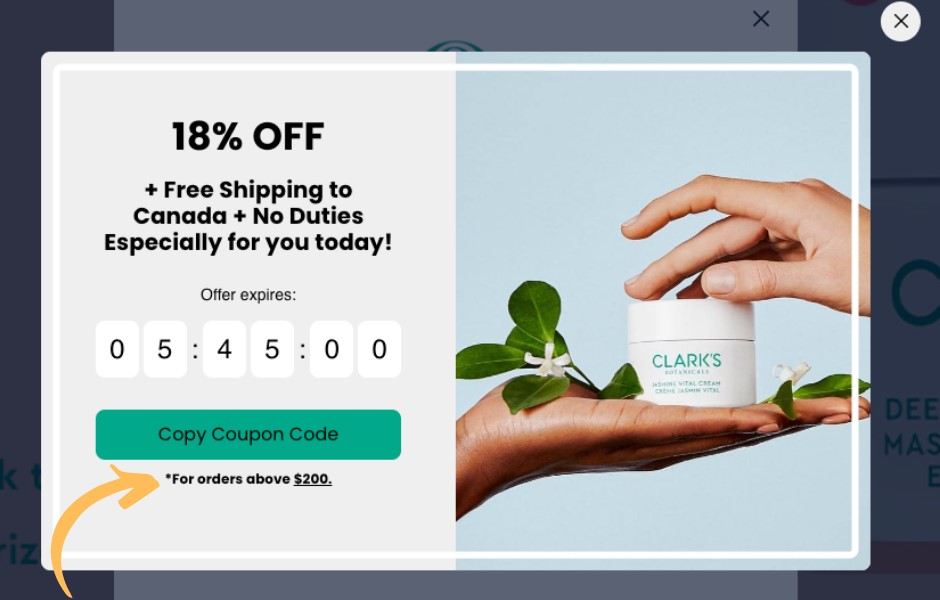
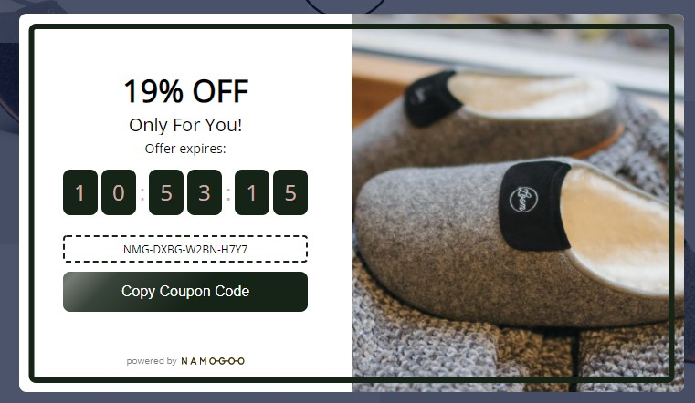
11. Add a countdown timer to encourage action
Countdown timers create a sense of urgency for your visitors. It makes them realize that time is ticking away and they might miss out. Some studies suggest that timers can achieve up to a 147% increase in conversions.
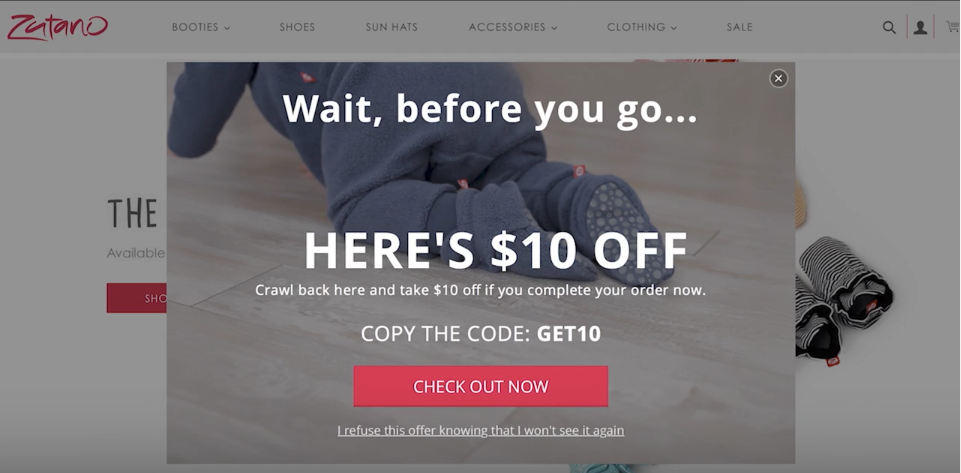
12. Implement exit-intent popups
Most visitors will leave your site without making a purchase. That’s true for any industry. Instead of letting them go, make a final effort to entice some kind of conversion.
Exit-intent popups recognize when a visitor is about to leave the page and display one final popup. Since they are only shown to people who are about to leave, you won’t be bombarding your visitors with interruptions. GetLeadForms finds these to be the most effective kinds of popups with conversion rates of up to 4%.
These offers have to be good because the customer was already on their way out. This could be a serious discount, a free gift, or a piece of content the visitor finds especially valuable.
13. Test your popups thoroughly
Your final step is the most important. The best practices on this list will help, but they are only best practices. You should routinely experiment with new popups, measure their results, and then use the variations that perform the best.
Here are the different elements of your popups that you can test:
- Display location and timing
- Design and imagery
- Font size and type
- Words and button text
Conversions Come From Reliable Feedback
Now that you understand the best practices for creating high converting popups, the next step is to build your own. Keep in mind, however, that best practices are only the starting point. Use them to establish your initial designs, and then test your pop-ups with real users.
You might learn, for instance, that following one of the best practices on this list isn’t right for your customers. Those test users might supply you with a key piece of feedback that boosts your popup conversions substantially and leads to serious revenue. But first you need honest conversations with genuine users.
Our managed user testing service identifies technical bugs or points of friction, so every campaign you run has the best chance at success. This can help you determine if your popups are displaying appropriate and at the right time across different devices, screen sizes, and browsers.
Our managed customer research service pairs you with real people in your target market to collect unfiltered feedback about your shopping experience.