While many factors contribute to conversion rate optimization, psychology plays a significant role in influencing user behavior. By understanding the psychological principles that drive human decision-making, online businesses can create effective strategies to optimize their conversion rates.
In this article, we will explore the key psychological principles that influence successful conversion rate optimization, and provide practical tips for implementing them on your website.
15 Psychological Principles That Can Improve Your Conversion Rate
The following psychological principles will help you understand how to use psychology to boost your online conversions and improve your bottom line.
1. Visual Salience
Visual salience is “the distinct subjective perceptual quality which makes some items in the world stand out from their neighbors and immediately grab our attention.”
Essentially, we like patterns, and when something stands out from the pattern, we tend to notice it. This phenomenon is an evolutionary throwback to when our survival depended on being able to spot differences in our environment.
In regards to marketing, this means you can draw attention to elements that are substantially different from other elements. The basic example is a call-to-action button that should be a different color than everything else on a page.
But you can use visual salience to highlight other elements as well. Text that is larger than other text is considered more important. A colorful image on an otherwise monochromatic page would be considered significant.
2. The Milgram Principle
Stanley Milgram was a psychologist and professor at Yale University who’s famous for conducting experiments on people’s willingness to obey authority (or perceived authority).
The Milgram experiment is a fascinating read. Basically, test subjects were ordered to harm other test subjects by an authority figure. (No one was really hurt. It was all fake.)

Milgram learned that ordinary people are likely to follow orders by an authority figure. They were even willing to kill innocent people if the order came from an authority that they recognized as morally or legally right. This learned response to authority is instilled at a very young age.
What does this mean for you? If you align your brand with an expert or authority figure, you can prod them toward the next step. (This is very similar to social proof.)
The trick is to find the person or organization that your customer finds authoritative and trustworthy. Once you find this entity, plaster them on your website with testimonials, logos, icons, and videos. CeraVe does this by using real doctors to recommend their products.

3. The Principle of Reciprocity
In an old experiment in the Journal of Applied Social Psychology, restaurant customers were given after-dinner mints with their check at the end of the meal. No explanation. Tips increased by about 3%. Not bad, but nothing special.
However, other customers were given the same mints, but the server stuck around and explained that the mints were specially for them. Tips increased by 20%.
This scenario invokes the principle of reciprocity. When you give someone something for free, they feel indebted to repay the favor somehow.
You can leverage this principle by giving your visitors something of value. This could be a free PDF guide, a discount code, a free gift, or access to a special community. Many of your visitors will reciprocate by purchasing or spending more.
BOOM! by Cindy Joesph offers makeup and beauty tips to all of her visitors. Once they accept the free guide, they become more likely to convert.

4. Cognitive Fluency
Cognitive fluency is the ease at which our brains understand information. We like to feel fluent when we explore websites, apps, and marketing communications.
If your site is complex, crowded, and hard to understand, your audience will feel confused and comfortable. You can even make them stressed, which is not how you get conversions.
This effect is similar to the Gestalt Principle, which “is an attempt to understand the laws behind the ability to acquire and maintain meaningful perceptions in an apparently chaotic world.”
When we’re presented with complex information, we naturally try to organize it into something simple that we can understand. For example, this image shows how our brain turns complex shapes into simple ones in order to avoid too much cognitive load.

Try not to overwhelm your audience’s brains with excess information. Opt for minimal styles with plenty of white space. Use words and images they understand without having to think too much.
Furthermore, don’t give your customers many choices. Too many options can overwhelm your shoppers and diminish conversions. If you burden them with too much, you might trigger analysis paralysis, which is the state of overthinking a situation to the point that a decision is never made.
Keep your product variations simple. Don’t expect them to make advanced customizations they don’t understand. And any time you want them to take an action – like fill out a form or complete a survey – make the work short and simple.
5. Loss Aversion / Pain Avoidance
Loss aversion is a psychological phenomenon in which people tend to feel the pain of losses more acutely than the pleasure of gains.
In other words, the negative emotions associated with losing something (such as money or possessions) are stronger than the positive emotions associated with gaining the same thing.
No, you shouldn’t cause pain to make people buy your products. But you can remind them of the pain or discomfort they are already experiencing.
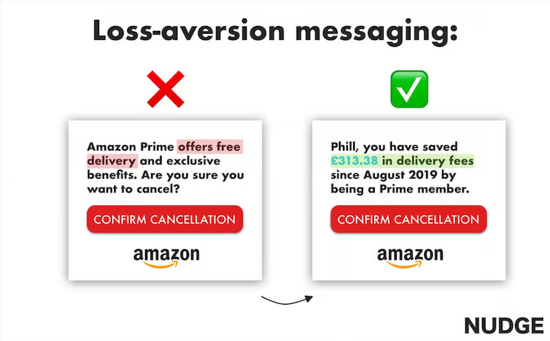
In the following example, notice how Amazon uses loss aversion in their copywriting. Instead of explaining what they’ll gain by staying a Prime member, they explain what they’ll lose by canceling.
6. Facial Recognition
As humans, we like to see other humans, particularly their faces. They attract our attention and make us feel comfortable. Studies show that our brains are heavily engaged when we look at faces, significantly more bodies, objects or animals.
Furthermore, facial expressions account for 55% of communication. You can convey a lot of information by simply showing someone’s face with your products, ads, and offers.
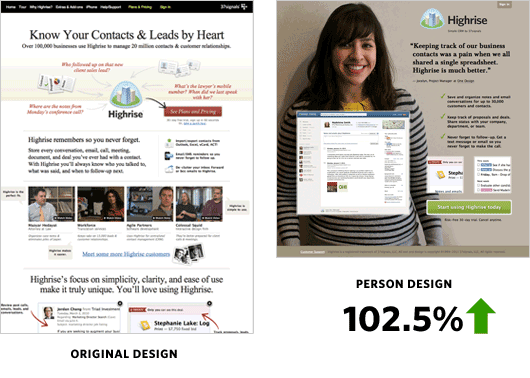
In one study, researchers examined different landing pages to see which style created the most conversions. After their testing period, they discovered that faces increase conversions substantially – by more than 100%! Here’s the before and after of that study.
7. The Decoy Effect
The decoy effect is the use of a product option that isn’t designed to sell, but to push customers toward a different option.
Consider the experiment conducted by psychologist Dan Ariely. Ariely discovered that adding a decoy subscription tier nudged people toward spending more money, even on products they didn’t need. The result was a 40% increase in revenue.
In order to use the decoy effect, you have to create a third option that is asymmetrical in value to the other two options. The third option should make one of the other two options look like an unbeatable deal. It must also be presented at the same time.
Here’s a practical example. Suppose you’re selling coffee:
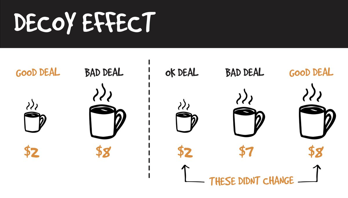
In the first pricing scheme, the cheap coffee seems like a good deal. People will buy based on their needs. They might conclude that the large is too expensive and too much coffee for their needs.
Once a decoy is added in the middle, the large coffee seems like a much better deal. The decoy option will cause customers to opt for the highest-priced product because now it seems like a deal. They’ll feel like they are winning.
8. The Ellsberg Paradox
The Ellsberg Paradox is based on a 1961 experiment that presented test participants with two different jars containing red and black balls. Jar #1 had 50 black balls and 50 red balls. Jar #2 had 100 balls in total, but the ratio was unknown.
Participants were asked to choose a jar and bet on a color. If they drew their chosen color, they would get $100. Most participants chose Jar #1 with the 50/50 mix.
This experiment tells us that people prefer known ratios. We’re much more comfortable when we know what we’re up against, even if there’s a chance that the unknown is better for us.
You can use this principle on your ecommerce site by simply giving your customers all of the information they need to make a decision. Avoid leaving anything out. The more transparent you are, the more your customers will feel comfortable about buying.
9. Color Psychology
Color psychology is a big topic, but it boils down to this: Colors can influence people’s emotions. If you use colors strategically throughout your site (and brand), you can affect the way people think about your business and your products.
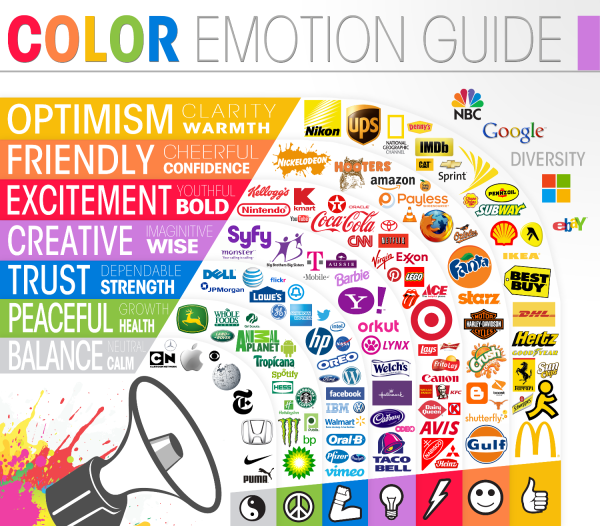
For instance, if you want your audience to feel confident, use orange. If you want your audience to feel strong, use blue. If you want them to be calm, use gray.
Which colors should you use? That depends how you want your audience to feel. Here’s a guide that gives you a general idea of what to use, but we strongly recommend reading up on color psychology because using multiple colors together can change their effect.
10. Fear of Missing Out
Fear of missing out, commonly known as FOMO, is a term used to describe the anxiety and unease that individuals feel when they believe they are missing out on something that others are experiencing.
The fear of missing out is often triggered by the perceived idea that everyone else is doing something exciting or having a great time, while we are not. This can lead to feelings of loneliness, inadequacy, and anxiety.
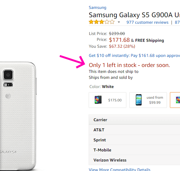
You can leverage FOMO by setting time limits or supply limits on your products and services. You can also use urgency language, such as “order before it’s too late” or “buy before summer ends!”
11. The “Because”
Psychologist Ellen Langer once conducted an experiment where she asked people if she could use the Xerox machine before them. Only 60% of people let her cut in line.
But when she said, “Excuse me, I have five pages. May I use the Xerox machine because I’m in a rush?” compliance rate rose to 94%.
It wasn’t the “I’m in a rush” part that persuaded them to let her cut the line. When she changed it to, “Because I’m in a hurry,” nearly everyone agreed (93%).
This tells us that the word “Because” is quite powerful. Whenever you ask someone to buy, explain why they need it. Tell them how your product will affect their lives. Explain how your product will make them a better version of themselves.
12. Visual Cueing
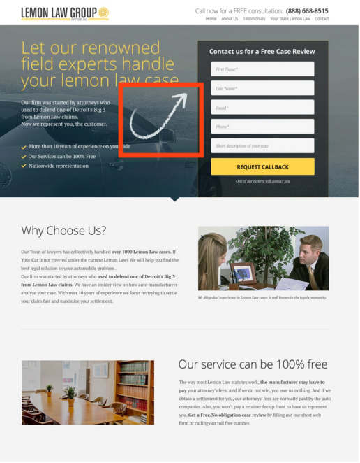
Visual cueing is the process of using visual elements to guide users in a particular direction. You might want them to complete a form, look at an important bit of text, or explore a product photo.
What kinds of cues can you use? You have lots of options, such as arrows, borders, pointing fingers, banners, check marks, photos of people, and more.
ConversionXL performed extensive eye tracking tests on visual cueing and found arrows are the most effective type of cue. That said, you should always run tests against your own audience.
13. Instant Gratification
It’s no secret that we hate to wait. We all want instant gratification for our problems. This isn’t a problem in a brick-and-mortar store where we can take our products away with us, but it presents a bit of a challenge for online sellers.
You can make your shoppers more likely to buy by finding ways to deliver your products and services as quickly as possible. Fast delivery has always been a powerful way of minimizing your customers’ anxiety.
It also helps to use urgency-related words in your marketing, like “instantly,” “immediately,” and “now.” These remind customers that they can get their problems solved quickly.
And if you sell digital products, deliver them immediately. There’s no need to keep your customer waiting for a product you can link to or email.
14. The Anchoring Effect
Anchoring is a cognitive bias of our tendency to rely heavily on the first piece of information we’re offered, especially when we’re making decisions. Basically, what we see first influences everything that comes after.
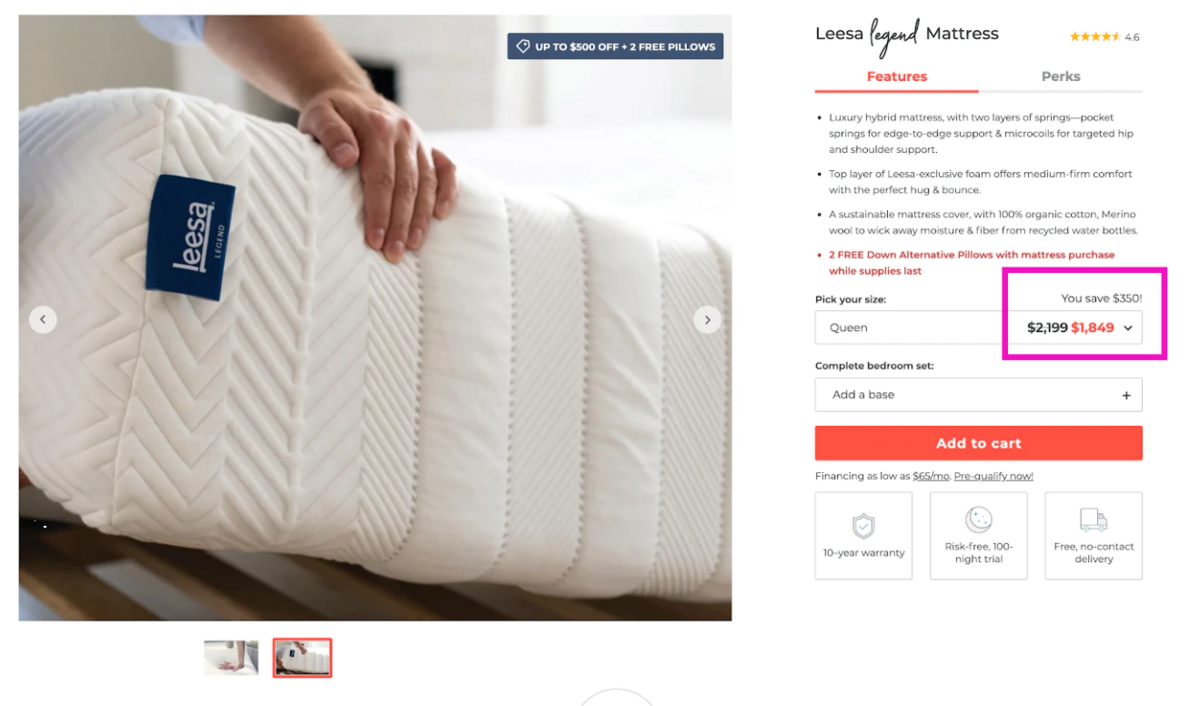
If you show a customer a high price, and then change it to a lower price, they’ll feel like they’re getting a good deal. This works even if the lower price was originally too high for them.
Notice how this product page lists the original price and then the discounted price. Seeing the price fall makes people more likely to buy.
15. Eliminate Friction
This isn’t really a “hack,” but it’s an important way to boost conversions with psychology.
Friction is a moment of frustration or stopped progress that customers experience as they navigate through your ecommerce site. If there’s too much friction in the experience, your shoppers will buy from an easier site.
“When users feel frustrated, they get stressed and cortisol starts to build up,” says Alex Birkett of ConversionXL. “If it hits a certain threshold, users will give up and go to your competitor’s site. Life is too short to go crazy trying to deal with crappy form design as well as unhelpful error handling.
Strive to eliminate all friction from the customer experience, but especially when it comes to your website. Make sure your menus are intuitive, your links work properly, and every button or widget performs just as your users would expect.
Feedback Before Optimizations
I’m giving you a big list of psychological principles that you can use to optimize your e-commerce site. But before you start making changes, it’s important to hear from your customers first. Their thoughts and feedback can be key to making the right psychological optimization on your site.
For instance, suppose a customer complains that they aren’t sure what to do next on a page. You might use some visual cueing to point them in the right direction. Or if a visitor isn’t sure if your product will work, you might include an expert recommendation.
UserInput helps website owners and marketers gather feedback from real users to improve their websites. Our managed customer research service pairs you with real people in your target market to collect unfiltered feedback about your shopping experience. Start your project today.
